
The interiors watchers amongst you will be interested in the recent new colour trends being announced for 2023!
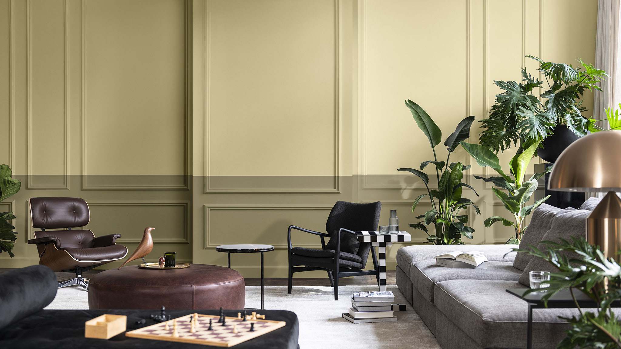
There’s a down-to-earth feel brewing, bringing it all back to the natural world. Earthy tones of yellow-pigmented creams, grey-whites, wheaty beiges, mossy greens and dark browns are dominating many of the new palette ranges recently launched by the likes of Farrow & Ball, Dulux and LICK.
 Haven’t we all done even the smallest bit of DIY-ing during and post lockdowns? For sure, we now all value our homes and surroundings much, much more. In my own home, we have just redecorated the kitchen/ living room from cool greys (too harsh) to warm greens and pinky-creams and it is so much homier and cosier. I just love it!
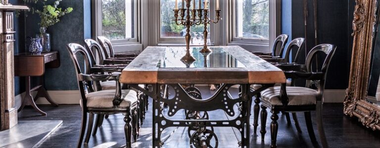
So, it’s back to the natural world, and the world around us for inspiration for our colour schemes and in fact the general feel of how we style and design our homes. Which is just great for vintage! Any kind of vintage, be that salvage, rustic, antique or reclaimed; it all just sings sustainability, mother earth, craftsmanship and down-to-earth.
[row]
[col span=”6″ span__sm=”12″ align=”center”]
[ux_image id=”114070″ width=”70″ height=”100%”]
[/col]
[col span=”6″ span__sm=”12″ align=”center”]
[ux_image id=”114071″ width=”70″ height=”100%”]
[/col]
[/row]
Ok so maybe you don’t buy it. You’re not a beige kind of person. That’s ok too!
The neutral palette promotes a more restful vibe and a nice canvas for contrasting richer colours, patterns and furniture. Without this contrast the muted colours can feel a bit bland. I hear you! Hence why, just as in nature, there are also deep, rich colours in these new paint palettes too. Many of the colours announced have punchier pops of deep toned reds, terracotta, teals, toffee browns that make great partners to the neutrals. Just like the rainbow feast of Autumn!
[row]
[col span=”4″ span__sm=”12″]
[ux_image id=”114076″ height=”100%”]
[/col]
[col span=”4″ span__sm=”12″]
[ux_image id=”114053″ height=”100%” caption=”true”]
Credit – Dulux
[/col]
[col span=”4″ span__sm=”12″]
[ux_image id=”114077″ height=”100%”]
Credit – Mad About The House
[/col]
[/row]
Haven’t we all done even the smallest bit of DIY-ing during and post lockdowns? For sure, we now all value our homes and surroundings much, much more. In my own home, we have just redecorated the kitchen/ living room from cool greys (too harsh) to warm greens and pinky-creams and it is so much homier and cosier. I just love it!
So, it’s back to the natural world, and the world around us for inspiration for our colour schemes and in fact the general feel of how we style and design our homes. Which is just great for vintage! Any kind of vintage, be that salvage, rustic, antique or reclaimed; it all just sings sustainability, mother earth, craftsmanship and down-to-earth.
[row]
[col span=”6″ span__sm=”12″ align=”center”]
[ux_image id=”114070″ width=”70″ height=”100%”]
[/col]
[col span=”6″ span__sm=”12″ align=”center”]
[ux_image id=”114071″ width=”70″ height=”100%”]
[/col]
[/row]
Ok so maybe you don’t buy it. You’re not a beige kind of person. That’s ok too!
The neutral palette promotes a more restful vibe and a nice canvas for contrasting richer colours, patterns and furniture. Without this contrast the muted colours can feel a bit bland. I hear you! Hence why, just as in nature, there are also deep, rich colours in these new paint palettes too. Many of the colours announced have punchier pops of deep toned reds, terracotta, teals, toffee browns that make great partners to the neutrals. Just like the rainbow feast of Autumn!
[row]
[col span=”4″ span__sm=”12″]
[ux_image id=”114076″ height=”100%”]
[/col]
[col span=”4″ span__sm=”12″]
[ux_image id=”114053″ height=”100%” caption=”true”]
Credit – Dulux
[/col]
[col span=”4″ span__sm=”12″]
[ux_image id=”114077″ height=”100%”]
Credit – Mad About The House
[/col]
[/row]
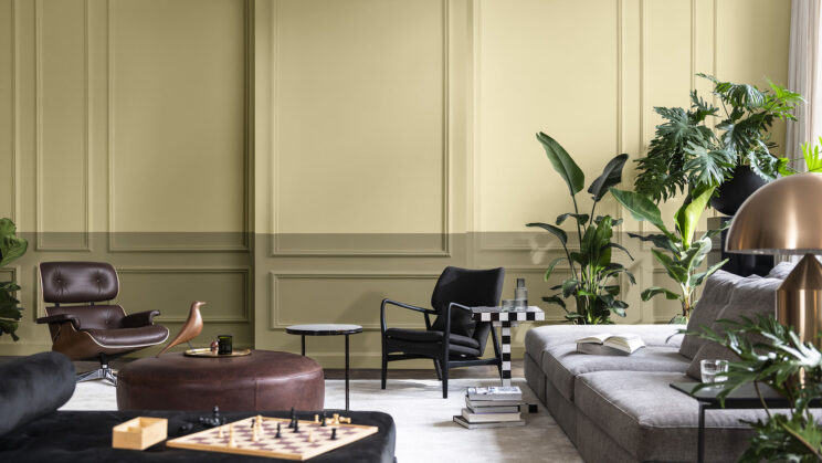
Dulux ‘Colour of the Year’
Dulux ‘Colour of the Year’, Wild Wonder is a kind of hay / dried grass colour of muted ochre. (Perhaps influenced by the 40+degree heat & scorched gardens we saw earlier this year…?!) It is meant to evoke the warm tones of harvest and a connection to nature. Dulux describe it as ‘the ‘magic of nature’ inspiring positive, glowing tones’ for the home for the year ahead. Indeed, amid such turbulent years as we’ve had, the overall need to feel calm, reassured, balanced has determined a relaxed, safe colour scheme among many of our homes already.
Haven’t we all done even the smallest bit of DIY-ing during and post lockdowns? For sure, we now all value our homes and surroundings much, much more. In my own home, we have just redecorated the kitchen/ living room from cool greys (too harsh) to warm greens and pinky-creams and it is so much homier and cosier. I just love it!
So, it’s back to the natural world, and the world around us for inspiration for our colour schemes and in fact the general feel of how we style and design our homes. Which is just great for vintage! Any kind of vintage, be that salvage, rustic, antique or reclaimed; it all just sings sustainability, mother earth, craftsmanship and down-to-earth.
[row]
[col span=”6″ span__sm=”12″ align=”center”]
[ux_image id=”114070″ width=”70″ height=”100%”]
[/col]
[col span=”6″ span__sm=”12″ align=”center”]
[ux_image id=”114071″ width=”70″ height=”100%”]
[/col]
[/row]
Ok so maybe you don’t buy it. You’re not a beige kind of person. That’s ok too!
The neutral palette promotes a more restful vibe and a nice canvas for contrasting richer colours, patterns and furniture. Without this contrast the muted colours can feel a bit bland. I hear you! Hence why, just as in nature, there are also deep, rich colours in these new paint palettes too. Many of the colours announced have punchier pops of deep toned reds, terracotta, teals, toffee browns that make great partners to the neutrals. Just like the rainbow feast of Autumn!
[row]
[col span=”4″ span__sm=”12″]
[ux_image id=”114076″ height=”100%”]
[/col]
[col span=”4″ span__sm=”12″]
[ux_image id=”114053″ height=”100%” caption=”true”]
Credit – Dulux
[/col]
[col span=”4″ span__sm=”12″]
[ux_image id=”114077″ height=”100%”]
Credit – Mad About The House
[/col]
[/row]